If you’ve ever scrolled past a profile with a bio that reads 𝓵𝓲𝓿𝓮, 𝓵𝓪𝓾𝓰𝓱, 𝓵𝓸𝓿𝓮 instead of plain old “live, laugh, love,” you’ve already met an Instagram font in the wild. That eye-catching text isn’t a special typeface Instagram unlocked for a lucky few — it’s something anyone can copy and paste in seconds, and it’s one of the easiest ways to make a profile, caption, or story feel more intentional and on-brand.
In this guide, we’ll break down exactly what Instagram fonts are, the most popular styles people are using right now, how to generate your own with InstaFontStudio, and a few things worth knowing before you switch your whole bio over to cursive script.
What Are Instagram Fonts, Really?
Instagram’s app only offers a small handful of built-in fonts, and only in Stories text boxes not in your bio, captions, or comments. So how do people get bold, cursive, or gothic-looking text everywhere else on the app?
The trick isn’t a font at all. It’s Unicode the massive international character-encoding standard that powers every emoji, symbol, and letter your phone can display. Buried inside Unicode are entire alphabets of stylized letters that were originally designed for math and science notation (like 𝔸, 𝒜, and Ⓐ), and font generators simply map your regular text onto those look-alike characters. The result looks like a different font, but it’s technically a string of special characters that any app, caption box, or username field will accept as plain text. That’s why you can paste stylish text into an Instagram bio without installing anything the “font” travels with the text itself.
Why Bother With Stylish Text at All?
A profile is often the first impression someone gets of a brand, creator, or small business, and small visual choices add up:
- It signals effort. A styled bio suggests the account is active and cared for.
- It breaks up the feed. On a screen full of plain grey text, a bold or script headline draws the eye.
- It reinforces a vibe. Soft script fonts read differently than bold block letters matching the font to your niche (aesthetic, streetwear, business, gaming) does real work for your brand identity.
- It’s genuinely free. Unlike most “engagement hacks,” this one costs nothing and takes ten seconds.
None of that guarantees more followers on its own good content still does the heavy lifting but it’s a low-effort polish that’s easy to get right.
Popular Instagram Font Styles (With Examples)
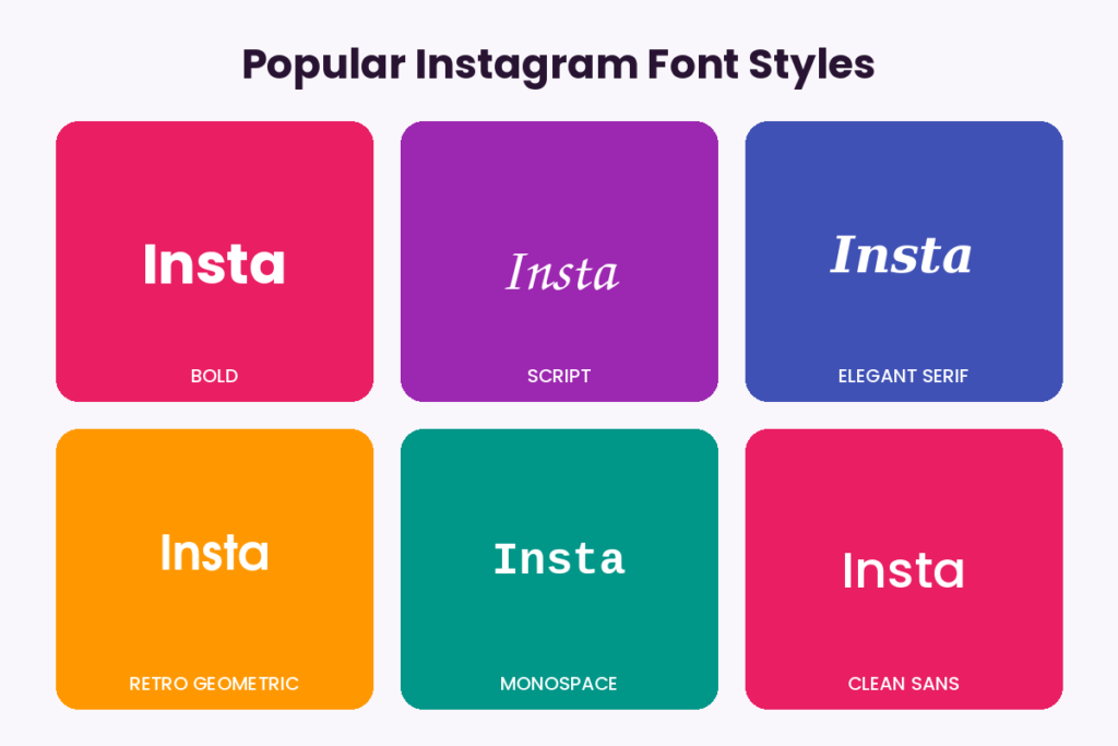
Here’s a look at the styles that show up most often in generators like InstaFontStudio, along with what they’re best used for.
1. Bold Fonts
Clean, heavy, and easy to read at a glance great for headline-style bio lines or a name that needs to stand out.
𝗕𝗼𝗹𝗱 𝗧𝗲𝘅𝘁 𝗘𝘅𝗮𝗺𝗽𝗹𝗲
2. Script & Cursive Fonts
Flowing, handwritten-style letters that feel personal and elegant a favorite for lifestyle, beauty, and wedding accounts.
𝓢𝓬𝓻𝓲𝓹𝓽 𝓣𝓮𝔁𝓽 𝓔𝔁𝓪𝓶𝓹𝓵𝓮
3. Gothic / Old English
Dramatic and heavy, often used by streetwear brands, tattoo artists, and gaming profiles.
𝕲𝖔𝖙𝖍𝖎𝖈 𝕿𝖊𝖝𝖙 𝕰𝖝𝖆𝖒𝖕𝖑𝖊
4. Double-Struck / Outline
An airy, outlined look that works well against busy backgrounds.
𝔻𝕠𝕦𝕓𝕝𝕖-𝕊𝕥𝕣𝕦𝕔𝕜 𝔼𝕩𝕒𝕞𝕡𝕝𝕖
5. Circled & Bubble Text
Playful, rounded characters that suit younger or more casual brands.
Ⓑⓤⓑⓑⓛⓔ Ⓣⓔⓧⓣ
6. Small Caps
A quieter, more refined alternative to full caps — popular in minimalist bios.
sᴀʟʟ ᴄᴀᴘs ᴛᴇxᴛ
7. Strikethrough & Underline
Useful for “before and after” style captions or a bit of visual sarcasm.
S̶t̶r̶i̶k̶e̶t̶h̶r̶o̶u̶g̶h̶ ̶T̶e̶x̶t̶
8. Upside Down Text
A novelty style that’s popular for jokes, puzzles, and pattern-interrupt captions.
ʇxǝʇ uʍop ǝpᴉsdn
Each of these is really just a different Unicode “skin” for the same underlying text which is exactly what makes them so portable.
How InstaFontStudio Works
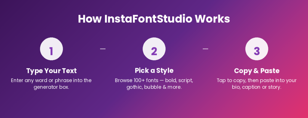
Generating stylish text takes three steps:
- Type your text into the generator box a name, bio line, or caption.
- Pick a style from the full list of fonts (bold, script, gothic, bubble, and dozens more).
- Copy and paste the result straight into your Instagram bio, caption, comment, or Story text box.
There’s nothing to download and no account to create the generator converts your text instantly, right in the browser.
Best Fonts for Different Parts of Your Profile
Not every style suits every spot. A few guidelines that tend to work well:
- Bio: Pick one font for your headline (name or tagline) and keep the rest of the bio in plain text. Two stylized lines is usually the ceiling before it starts to look cluttered.
- Captions: Use a stylized opening line to hook attention, then switch back to normal text for the body — long captions in fancy Unicode fonts get harder to read.
- Story text: Instagram’s native Story fonts already cover a lot of ground, so save generator fonts for a specific accent word rather than a full sentence.
- Usernames: Some fancy characters aren’t accepted in the username field (only your display name), so test before committing display names are more flexible.
Font Pairing Tips for a Cohesive Feed
If your grid, bio, and highlight covers all use completely different font styles, the profile can feel disjointed. A simple rule that works for most brands: pick one primary style (say, bold or elegant serif) for anything permanent your name, your highlight titles and reserve a second, more expressive style (script or bubble) purely for temporary things like captions or Story text. That contrast reads as intentional instead of random.
A Few Things Worth Knowing First
Stylish text is genuinely fun to use, but a couple of practical notes will save you some frustration:
- Not every device renders every character. Because these are niche Unicode blocks, very old phones or certain fonts may show a small “tofu” box (□) instead of the intended letter. Sticking to the more common styles (bold, italic, script) minimizes this risk.
- Screen readers often can’t parse them. Because stylized characters are technically math symbols rather than letters, screen readers used by visually impaired users may read them as gibberish or skip them entirely. It’s worth keeping critical information your actual name, a phone number, a link description in plain text, and saving stylized fonts for decorative flourishes.
- They won’t affect the algorithm. Instagram doesn’t rank stylized text differently from plain text, so treat this as a design choice, not a growth hack.
Frequently Asked Questions
Are Instagram fonts free to use? Yes. Because they’re standard Unicode characters rather than licensed typefaces, generators like InstaFontStudio are free, and there’s no copyright restriction on using them.
Will using fancy fonts get my account flagged or shadowbanned? No. Stylized Unicode text is just text . Instagram doesn’t penalize accounts for using it in bios, captions, or comments.
Can I use these fonts in my username, or only my display name? It depends on the character set. Instagram’s username field is more restrictive than the display name field, so some fancy styles will only work in your display name, bio, or captions.
Do these fonts work on other apps like TikTok, Twitter/X, or Facebook? Yes , since the styling comes from Unicode rather than an Instagram specific feature, the same copied text will display correctly on virtually any app or platform.
Why do some of the symbols show up as little boxes? That usually means the device or font being used doesn’t have that particular Unicode character mapped to a visible glyph. It’s more common with obscure symbol sets and rare on mainstream styles like bold or script.
Final Thoughts
A few seconds spent picking the right font style is a small thing, but it’s one of the easiest ways to make a profile feel more considered . whether that’s a soft script for a lifestyle brand or bold block letters for a business account that needs to look sharp.
Head over to InstaFontStudio to try the generator, mix a few styles together, and find the look that fits your feed.