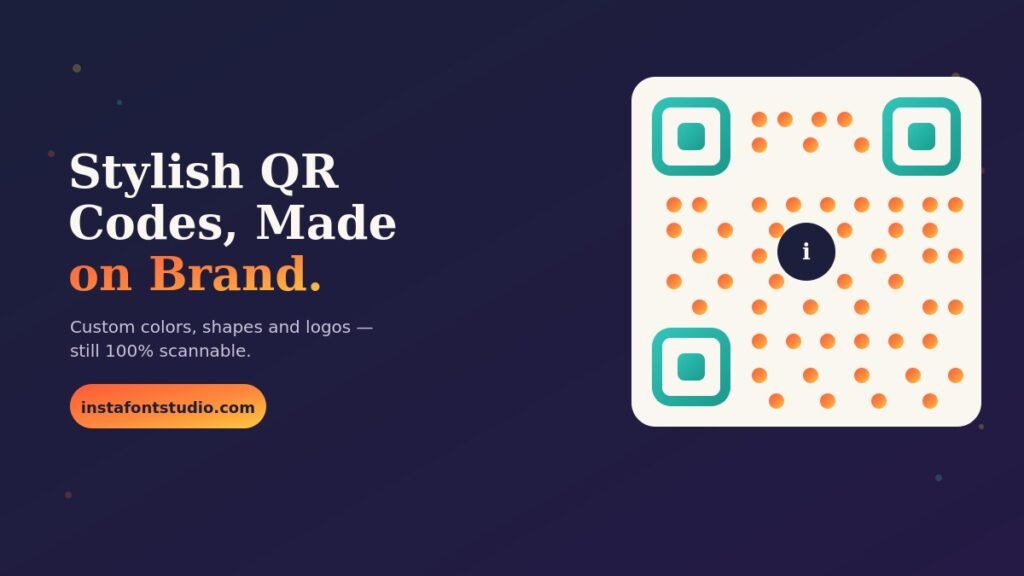
There’s a specific kind of disappointment in handing someone a beautifully designed menu, business card, or event flyer — and then watching them squint at a jagged black-and-white square stapled onto the corner of it like an afterthought. It works, technically. It also looks like it wandered in from 2011.
QR codes aren’t going anywhere. If anything, they’ve become the default way people move from something physical (a table, a poster, a package) to something digital (a link, a menu, a follow button). But almost nobody bothers to make theirs look like part of the design instead of an intrusion on it. That’s the gap a stylish QR code generator closes, and it’s the same gap InstaFontStudio has been closing for text with its font generator — we just built the same idea for codes.
Here’s what a QR code actually is, why the stock version looks the way it does, and how to build one that matches your brand instead of fighting it.
What Makes a QR Code “Stylish” in the First Place?
A QR code is really just a grid of black and white squares that encodes data — a URL, a Wi-Fi password, a contact card. Underneath the visual, error-correction math is doing the heavy lifting: QR codes are built with enough redundancy that a scanner can still read the code even if a meaningful chunk of it is missing, covered, or altered. Depending on the error-correction level chosen when the code is generated, that redundancy can run anywhere from about 7% up to roughly 30%.
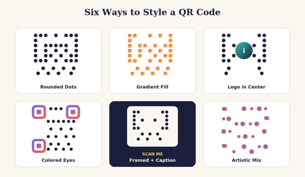
That built-in tolerance is exactly what makes styling possible. A generator can round the corners of each module, swap black for a brand color or gradient, redraw the three big corner squares (called “finder patterns” or “eyes”) in a different shape, and even drop a small logo in the center — all without breaking the underlying pattern a scanner needs to read. You’re not decorating on top of the code. You’re changing how the code itself is drawn, while keeping the data structure intact.
Why It’s Worth Doing at All
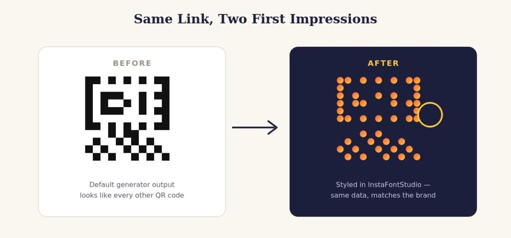
A default QR code isn’t broken. It’s just generic, and generic has a cost:
- It looks like clip art. A jagged black square next to a carefully chosen font and color palette reads as an afterthought, because it usually is one.
- People hesitate to scan strange-looking codes. Malicious QR codes are a real enough concern that a slightly more polished, obviously branded code reads as more trustworthy than a bare one someone printed off a random website.
- It’s free advertising real estate. The code itself can carry your brand colors the same way a logo does. Every scan is a small, repeated brand impression.
- Consistency compounds. A restaurant that styles its menu QR to match its signage looks like it thought about the whole experience, not just the parts a customer walks past.
None of this replaces good content behind the link — a stylish QR code pointing at a broken page is still a broken experience. But the code itself doesn’t have to be the weak link in an otherwise considered design.
How the InstaFontStudio QR Generator Works
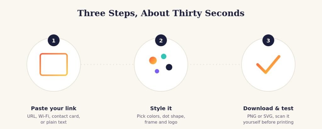
We built the QR code generator to work the same way our font tool does — no downloads, no account, nothing to install:
- Paste what you want people to land on. A website link, an Instagram profile, a Wi-Fi network, a vCard contact, plain text — whatever you’re pointing people toward.
- Style it. Choose a dot color or gradient, pick a shape for the corner “eyes,” add a frame with a caption like “Scan Me,” and drop in a logo if you have one.
- Download and test it yourself before it goes anywhere near a printer. Grab it as a PNG for quick use or an SVG if it’s heading to a large banner or poster, and scan it with your own phone first.
That last step matters more than people expect, and we’ll get to why in a minute.
Where a Better-Looking Code Actually Pays Off
A few places where the upgrade is genuinely noticeable:
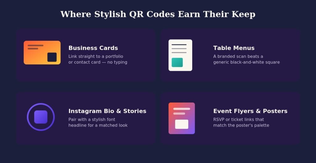
Business cards. A tiny styled code that matches your card’s color scheme feels intentional in a way a stock code never does, and it can carry a link to a portfolio, LinkedIn, or a saved contact card instead of forcing someone to type your number in by hand.
Restaurant and cafe tables. Contactless menus aren’t going away, and a code that matches the restaurant’s branding feels like part of the table setting instead of a sticker someone slapped on during the pandemic.
Instagram bios and Story stickers. If you’ve already styled your bio headline with a font from our font generator, a matching QR code linking to your latest drop, waitlist, or booking page keeps the whole profile visually consistent instead of looking like two different tools built it.
Event flyers and posters. An RSVP or ticket link that picks up the poster’s accent color reads as designed, not bolted on — and it’s one less visual element competing for attention against everything else on the page.
Packaging and print ads. Anywhere a code has to survive being printed small, styled dots with strong contrast hold up better under low-resolution printing than default modules do.
Design Rules That Keep a Styled Code Scannable
This is the part people skip, and it’s the part that actually matters. A gorgeous QR code that doesn’t scan is worse than an ugly one that does. A few rules worth following every time:
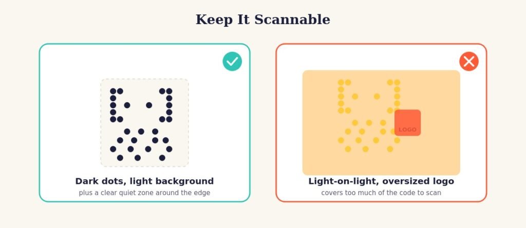
- Keep contrast high. Dark dots on a light background (or the reverse) scan reliably. Two mid-tone colors that are close in brightness .a coral dot on a peach background, say — can trip up a scanner even though it looks fine to your eye.
- Leave the quiet zone alone. That blank margin around the edge of a QR code isn’t wasted space — it’s how a scanner’s camera knows where the code starts and stops. Don’t crop it tight to save room.
- Go easy on the logo. A small logo in the center, sitting inside that higher error-correction buffer, is usually fine. A logo that covers a quarter of the code is asking for trouble.
- Test at the actual size it’ll be printed. A code that scans perfectly on your laptop screen can fail on a 1-inch flyer thumbnail or a low-quality print run. If it’s going small, simplify the styling and boost the error-correction level.
- Always do a real scan test with more than one phone before it goes to print. It costs ten seconds and it’s the single easiest way to avoid a QR code that leads nowhere.
Customization Options Worth Knowing About
Not every option matters for every use case, but here’s what’s actually adjustable and when to reach for it:
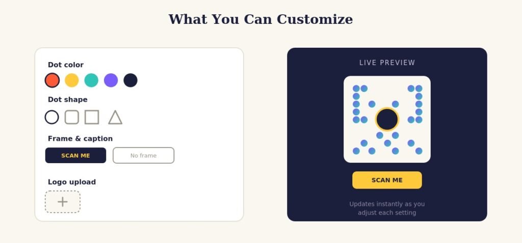
- Dot color or gradient — match your palette exactly, or pull from a brand kit if you’ve got hex codes handy.
- Dot and eye shape — rounded, square, or a softer “dots” pattern for the eyes changes the whole personality of the code without touching the data.
- Frame and caption — a small “Scan Me” or “Follow Us” label around the code removes any doubt about what it’s for, which matters more than people assume; plenty of people still don’t reflexively scan every code they see.
- Center logo — a small, simple mark reads better than a detailed one. Simplify before you upload.
- Background — transparent backgrounds are worth using if the code is going on top of a colored section of a design rather than a plain white card.
A good habit: pick one accent color for the code and pull it straight from whatever you’re already using for headlines, buttons, or a stylized bio font. It’s a small detail, but it’s the difference between a code that looks chosen and one that looks defaulted.
Frequently Asked Questions
Is the QR code generator free to use? Yes. Generate and download as many codes as you want at instafontstudio.com/qr-code-generator no account required.
Do styled QR codes scan as reliably as plain black-and-white ones? Yes, as long as contrast stays high and the quiet zone around the edge is left intact. The styling changes how the modules are drawn, not the underlying data or error-correction structure.
Can I use my own logo in the center? Yes. Keep it small relative to the overall code, and simple a wordmark or icon works better than a detailed photo.
Will the code still work if I resize it? QR codes are made of vector-friendly patterns, so downloading the SVG version lets you scale up for posters or banners without losing sharpness. Just re-test the scan at the final print size.
What’s the difference between a static and dynamic QR code? A static code has the destination baked directly into the pattern reliable, but the link can’t be changed later. A dynamic code (offered by some link-shortening services) redirects through a URL you control, so you can update the destination after the code is already printed. For a one-off flyer, static is usually all you need.
Can I use these codes for anything besides links? Yes Wi-Fi credentials, plain text, contact cards, and more all encode the same way a URL does.
Final Thoughts
A QR code is often the last thing standing between someone’s curiosity and your actual content, and it’s worth treating like the rest of your design rather than an accessory to it. The generator handles the technical side — error correction, module placement, contrast checks — so styling one takes about as long as picking a font.
Try the stylish QR code generator at InstaFontStudio, pair it with a headline from our font generator for a matching look across your bio and print materials, and give it a real scan test before it goes anywhere near a printer.